
Welcome to the world of email marketing, where crafting the perfect message is only half the battle. Did you know that the colors you choose for your emails can have a huge impact on how recipients engage with your content? That’s right – the best colors for email marketing can make all the difference when it comes to boosting open rates, click-through rates, and conversions.

In this article, we’ll explore the fascinating world of color psychology and how it can be used to your advantage in email campaigns. We’ll delve into the factors to consider when selecting colors, the different color schemes you can use, and even examine the impact of individual color preferences on your audience. So, whether you’re a seasoned email marketer or just starting out, join us as we explore the best colors for email marketing and discover how they can take your campaigns to the next level.
Understanding Color Psychology in Email Marketing
Understanding color psychology is essential to choosing the best colors for email marketing. Colors can evoke emotions and perceptions, which can influence how recipients engage with your content. For instance, warm colors like red and orange can create a sense of urgency and excitement, while cool colors like blue and green can promote calmness and trust.
When it comes to selecting the best colors for marketing, it’s crucial to consider the audience you’re targeting. Different colors may resonate with different demographics, cultures, and even geographic regions. For example, red is associated with good fortune and happiness in Chinese culture, while green is a popular color in Middle Eastern countries and symbolizes wealth and prosperity.
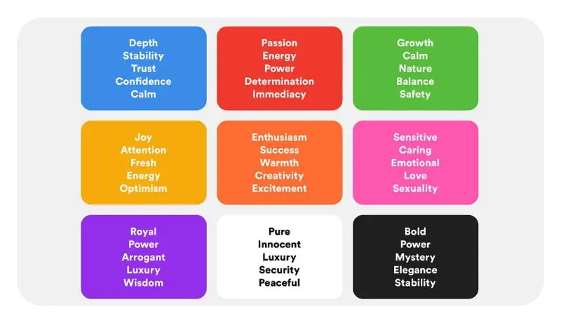
Another important aspect to consider is the impact of colors on recipient actions. Certain colors have been shown to increase click-through rates and conversions, making them the best colors for marketing in specific contexts. For instance, studies have found that blue and green are effective in promoting trust, which can be useful in email campaigns that require recipients to take a specific action, such as filling out a form or making a purchase.
By understanding the principles of color psychology and its impact on recipient behavior, you can choose the best colors for email marketing campaigns that will not only grab attention but also increase engagement and conversions. In the next section, we’ll explore the factors to consider when selecting the right colors for your email campaigns.
Choosing the Right Colors for Email Campaigns
When it comes to choosing the best colors for branding in your email campaigns, there are several factors to consider. First and foremost, it’s important to align your color choices with your brand identity and message. Your colors should be consistent with your brand’s overall tone, personality, and values. This can help establish brand recognition and build trust with your audience.
Another key consideration is the color preferences and demographics of your target audience. You want to choose colors that resonate with your audience and create a positive emotional response. For example, if your audience is primarily women, you may want to consider using colors like pink or purple, which are often associated with femininity.

It’s also important to take into account the context of your email campaign. Are you promoting a sale or a new product? Are you sending a newsletter or a promotional email? The type of email you’re sending can influence the best colors for branding. For example, a promotional email may benefit from bold and attention-grabbing colors, while a newsletter may require a more subdued color palette.
Finally, it’s essential to test and analyze the effectiveness of your color choices. A/B testing can be an effective way to compare the performance of different color variations and identify the best colors for branding in your specific context. By tracking metrics like open rates, click-through rates, and conversions, you can optimize your email campaigns for maximum impact.
Choosing the best colors for branding in your email campaigns can be a daunting task, but with careful consideration of your brand identity, target audience, and context, you can create visually appealing and effective email campaigns that resonate with your audience and drive results. In the next section, we’ll explore the different color schemes you can use to enhance the impact of your email campaigns.
Color Schemes for Successful Email Marketing
Color schemes play a crucial role in the success of your email marketing campaigns. The right color scheme can not only grab attention but also convey your brand’s message and personality effectively. In this section, we’ll explore the different color schemes you can use to enhance the impact of your email campaigns.
Complementary colors are a popular color scheme choice for email marketing campaigns. Complementary colors are colors that are opposite each other on the color wheel, such as blue and orange or red and green. These colors create high contrast and can be eye-catching, making them perfect for promotional emails or calls-to-action.
Analogous color schemes are another option to consider. Analogous colors are colors that are next to each other on the color wheel, such as blue and green or yellow and orange. These color schemes can create a sense of harmony and unity, making them a great choice for newsletters or informational emails.
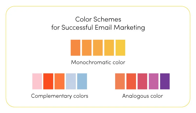
Monochromatic color schemes are also popular for email marketing campaigns. Monochromatic colors are shades and tints of a single color. This color scheme can create a sophisticated and elegant look and can be effective for email campaigns that require a more subdued color palette.
When selecting a color scheme for your email campaign, it’s important to keep in mind the context and goal of the email. For example, a monochromatic color scheme may not be the best choice for a promotional email, while an analogous color scheme may not be effective for a call-to-action email.
It’s also important to pay attention to color contrast when choosing a color scheme. High contrast can make your email more readable and accessible to a wider audience, while low contrast can make your email more difficult to read, especially for those with visual impairments.
By carefully selecting a color scheme that aligns with your brand identity and the context of your email campaign, you can create visually appealing and effective email campaigns that resonate with your audience and drive results. In the next section, we’ll explore the top colors for email conversions and how to use them effectively in your campaigns.
Top Colors for Email Conversions
Colors can have a significant impact on the success of your email marketing campaigns. The right color choices can grab your audience’s attention, evoke emotions, and ultimately lead to higher engagement and conversions. In this section, we’ll explore the top colors for email conversions and how to use them effectively in your campaigns.
Red is a color that is known to create a sense of urgency and excitement. It can be effective in promotional emails or emails that require immediate action, such as limited-time offers or flash sales. Red is also associated with passion and energy, making it a great choice for brands that want to convey a bold and dynamic image.
Blue is a calming color that can create a sense of trust and reliability. It’s often used in corporate branding and can be effective in emails that require a more professional tone, such as newsletters or informational emails. Blue is also associated with intelligence and competence, making it a great choice for brands that want to convey a sense of expertise and authority. IBM, Facebook, and LinkedIn are great examples.
Green is a color that is associated with growth, health, and nature. It can be effective in emails that promote wellness or sustainability products or services. Green is also associated with money and wealth, making it a great choice for financial institutions or brands that want to convey a sense of prosperity.

Orange is a color that is associated with excitement, enthusiasm, and warmth. It can be effective in emails that promote products or services that are fun or exciting, such as entertainment or travel. Orange is also associated with affordability and value, making it a great choice for brands that want to convey a sense of affordability or accessibility.
Yellow is a color that is associated with happiness, optimism, and youthfulness. It can be effective in emails that promote products or services that evoke positive emotions, such as fashion or beauty products. Yellow is also associated with creativity and innovation, making it a great choice for brands that want to convey a sense of originality and uniqueness.
When using these top colors for email conversions, it’s important to consider the context and tone of your email campaign. The same color that works well for one brand or product may not be effective for another. By understanding the psychology of color and carefully selecting the right colors for your brand and message, you can create email campaigns that stand out and drive results. In the next section, we’ll explore how to enhance email engagement with colors.
Enhancing Email Engagement with Colors
Colors can be a powerful tool for enhancing email engagement and making your messages more memorable. In this section, we’ll explore some strategies for using colors to improve the visual appeal and readability of your emails.
One way to enhance email engagement with colors is to use them strategically to draw attention to key elements of your message. For example, you could use a bold color for your call-to-action button to make it stand out and encourage recipients to take action. Alternatively, you could use color accents to highlight important text or headings within your email.
Another strategy for using color in email marketing is to create a cohesive and visually appealing design. By selecting a color scheme that complements your brand identity and message, you can create a more professional and polished look for your emails. For example, you could use a monochromatic color scheme with different shades of the same color for a minimalist and elegant look, or a complementary color scheme for a more vibrant and energetic feel.

Fonts can also play a role in enhancing email engagement with colors. By selecting fonts that complement your color choices and message, you can create a more cohesive and readable design. For example, you could use a sans-serif font for headings and a serif font for body text for a classic and timeless look.
Incorporating imagery can also be an effective way to enhance email engagement with colors. By using high-quality images that complement your color scheme and message, you can create a more visually engaging and memorable email. For example, you could use product images or lifestyle photos to showcase your products or services and evoke positive emotions in your audience.
Overall, by using colors strategically and thoughtfully in your email marketing campaigns, you can enhance engagement and create a more memorable brand experience for your audience. In the next section, we’ll explore the impact of individual color preferences on email recipient responses.
Optimizing Email Marketing with the Right Colors
Optimizing your email marketing campaigns with the right colors is crucial for improving engagement and driving conversions. In this section, we’ll explore some techniques for testing and measuring the effectiveness of different color variations, as well as strategies for ongoing optimization and improvement.
One of the most effective techniques for optimizing email marketing with the right colors is A/B testing. This involves creating two versions of your email with different color variations and sending them to a small sample of your audience. By tracking metrics like open rates, click-through rates, and conversions, you can identify which color variation performs best and use that color scheme for your main email campaign.

Another technique for optimizing email marketing with colors is to track and analyze data on recipient behavior and engagement. By monitoring metrics like bounce rates, unsubscribes, and spam complaints, you can identify potential issues with your email design or content and make improvements accordingly. Additionally, by tracking metrics like engagement rates and conversions, you can determine which color schemes and design elements are most effective at driving customer action.
It’s also important to regularly refresh and update your email campaigns to keep them engaging and relevant to your audience. By experimenting with different color schemes, layouts, and content, you can keep your emails fresh and interesting while also optimizing for performance. Additionally, by staying up-to-date on industry trends and best practices, you can ensure that your emails are always on the cutting edge of email marketing.
Ultimately, optimizing email marketing with the right colors requires a combination of creativity, data analysis, and ongoing optimization. By testing different color variations, monitoring recipient behavior and engagement, and regularly updating your campaigns, you can create more effective and engaging emails that drive real results for your business.
Conclusion
Choosing the best colors for email marketing is essential for creating effective campaigns that engage and convert recipients. By understanding color psychology, considering factors like target audience preferences and brand identity, and experimenting with different color schemes and design elements, you can create emails that stand out and drive real results for your business. Whether you’re looking to increase open rates, drive click-throughs, or boost conversions, optimizing your email campaigns with the right colors can make all the difference. By testing, analyzing data, and adapting your strategies based on audience response, you can create more effective and impactful email campaigns that help your business thrive.
FAQ
How do colors impact email marketing performance?
Colors can evoke emotions, attract attention, and influence recipient behavior, thereby impacting email marketing performance. Choosing the right colors can enhance engagement, click-through rates, and conversions.
Which colors are considered effective for email marketing?
The effectiveness of colors can vary based on factors like target audience, brand identity, and message. However, some commonly effective colors for email marketing include vibrant shades of blue, green, red, and orange.
How can I choose the right colors for my email campaigns?
Consider your brand identity, target audience, and the emotions you want to evoke. Conduct A/B testing with different color variations to determine the most effective combination for your specific email campaigns.
Are there specific color schemes that work well in email marketing?
Yes, certain color schemes, such as complementary or contrasting colors, can enhance the visual appeal of email campaigns. Experiment with different color schemes to find the ones that resonate with your brand and audience.


 Facebook Ads Spy Tool
 TikTok Ads Spy Tool